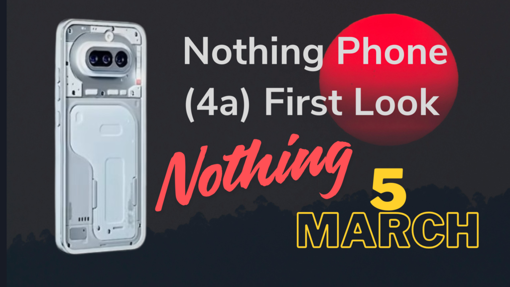
The upcoming Nothing Phone (4a) is easily one of the most talked-about smartphone releases of 2026. With the global debut set for March 5 in London, the brand has already shared the first official look of the device, surprising fans with a design that feels calmer, cleaner and more mature. It’s still unmistakably Nothing, but with a tone that suggests the company is refining its identity rather than reinventing it.
This long-form breakdown dives deep into everything revealed so far: the subtle design shifts, the new Glyph Bar, the updated camera layout, the rearranged button placements and why this device might mark a new design direction for Nothing’s mid-range lineup.
Table of Contents
1. Introduction
The Nothing Phone (4a) isn’t trying to be loud. That’s the first impression the brand wants to deliver with its newly teased official image. After years of bold experiments with rear camera shapes, transparent elements and dramatic glyph patterns, Nothing seems to be taking a softer approach this year.
But make no mistake. This doesn’t mean the company is “playing safe.” Instead, it feels like an evolution. A refinement. A maturing design philosophy that balances identity with practicality.
2. The Evolution of Nothing’s Design Language
Nothing’s phones have always stood out because they refuse to look like anything else on the market. Over the years, the company has explored:
- Scattered glyph LEDs around the camera (Phone 1)
- Large sweeping arcs (Phone 2a, Phone 3a)
- A circular Glyph Matrix (Phone 3)
- Transparent casings revealing internal design elements
- Asymmetrical camera shapes and bold layouts
This willingness to experiment has earned the brand a cult-like fan following. But it has also resulted in mixed reactions, especially with the flagship Nothing Phone (3), which many users found a bit too unconventional.
The Phone (4a) appears to take the spirit of those designs while smoothing out the rough edges.
3. First Look at the Nothing Phone (4a)
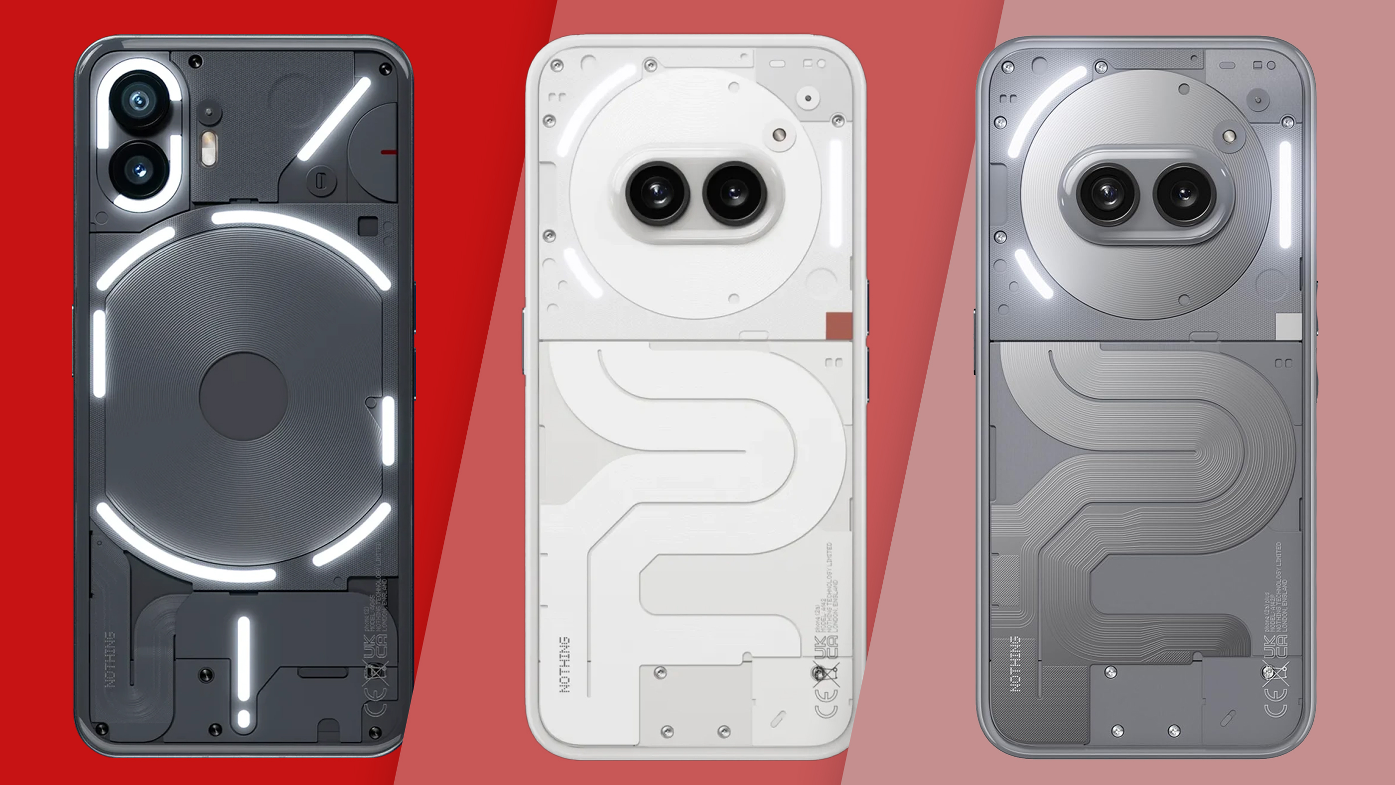
The first image shared by Nothing gives us a clear look at the white-silver finish model. The rear layout is symmetrical, tidy and visually balanced. Fans immediately noticed how different it looks from the dramatic Phone (3) while still feeling like a true Nothing product.
At a glance, the device looks almost minimalistic compared to its predecessors.
4. A Cleaner and More Familiar Aesthetic
Unlike the more experimental look of previous generations, the Phone (4a) embraces a clean, balanced, and approachable design. The transparent back remains, but this time the layout feels more intentional.
The finish combines:
- White and silver tones
- A softer dual-tone lower half
- A flatter camera island
- A simplified glyph pattern
It’s the visual equivalent of a brand taking a deep breath and decluttering.
5. The Updated Camera Module
The camera setup may remind you of the Nothing Phone (3a), but it has its own identity.
Key visible changes include:
- A flat base instead of a rounded one
- A more pronounced protrusion
- A horizontal and symmetrical alignment
- A centrally positioned module with three sensors
This setup looks practical and refined. It’s a shift from aesthetic experimentation to functional clarity, which many users may appreciate.
6. The New Glyph Bar Interface
Nothing is known for reinventing the Glyph Interface with every generation. From scattered strips to circular arrays, each model has tried a different take.
This time, the Phone (4a) introduces what the brand calls the Glyph Bar.
What’s new:
- A vertical bar on the right side of the rear panel
- Six LED squares stacked vertically
- Each square is built from nine mini LEDs
- A signature red dot LED adds an iconic Nothing detail
- More subtle light output compared to earlier models
This shift gives the device a more structured look. It’s less flashy, but still recognisable as a Nothing phone.
Likely use cases include:
- Incoming calls and notifications
- Charging progress
- Timer indicators
- App-based interactions
- Essential alerts
Fans are split: some find it cleaner, others miss the dramatic arcs from previous models. But that debate has always been part of Nothing’s charm.
7. Button Placement and Functional Redesign
One of the biggest ergonomic changes is the button relocation.
What’s different now:
- The Essential Key (AI button) moves to the left
- Volume and power keys shift to the right
- Essential Key is placed higher to avoid accidental presses
This new setup makes more sense in daily use. It clusters the most-used buttons together while keeping the AI-specific key isolated for intentional interactions.
8. Transparent Finish with Dual-Tone Styling
The transparent aesthetic remains, because at this point it’s core to Nothing’s identity. But the Phone (4a) makes it more subtle.
The dual-tone section is split into white and grey shades. Internal components appear cleaner, with fewer segmented lines and a more cohesive layout.
This is transparency done in a mature, minimalistic way.
9. Expected Variants and Colour Options
While the company has officially shown the white-silver model, rumours hint at:
- Blue
- Pink
- Possibly a darker tone
Nothing often introduces bold colours later in the cycle, so we could see surprises after launch.
10. How Fans Are Reacting So Far
Reactions to the design reveal have been mixed.
Positive comments include:
- Cleaner and more balanced
- Looks more premium
- Feels like a return to older Nothing design cues
- Glyph Bar looks fresher
Criticism includes:
- Some miss the flashy lights
- Others preferred the Phone (3a) arcs
- A few wanted a bigger redesign
This isn’t new for Nothing. Every release divides fans. The company even seems to enjoy that debate, using it as fuel to push boundaries each year.
11. What This Means for Nothing’s Future Phones
The Phone (4a) suggests that the brand is growing into its identity. Instead of redesigning purely for shock value, Nothing is refining what works and discarding what doesn’t.
We could see:
- More symmetrical layouts
- More structured glyph systems
- More ergonomic button placements
- A shift toward premium minimalism
Nothing may be entering a phase where function meets the iconic aesthetic the company is known for.
12. Nothing Phone (4a) vs Phone (3) and Phone (3a)
Compared to Phone (3):
- Much simpler rear design
- No circular Glyph Matrix
- More symmetrical camera module
- Cleaner back panel
Compared to Phone (3a):
- Updated flat camera layout
- New vertical Glyph Bar
- Refined dual-tone finish
- Improved ergonomics
The Phone (4a) feels like a blend of the familiarity of Phone (3a) with a new design direction that’s more mature than Phone (3).
13. Launch Expectations: What Else Could Debut
Nothing is rumoured to launch two models:
- Nothing Phone (4a)
- Nothing Phone (4a) Pro
We may also see new accessories, AI features, and software improvements aligned with the brand’s push into on-device intelligence.
14. Final Thoughts and Conclusion
The Nothing Phone (4a) marks a meaningful shift in the brand’s design philosophy. While still maintaining the transparent aesthetic and LED identity, it streamlines the overall look into something cleaner and more polished.
The new Glyph Bar, symmetrical camera module, refined ergonomics and dual-tone styling all hint at a brand maturing without losing its edge. Some users will love it. Some will miss the older approach. And Nothing seems perfectly fine with that.
What’s clear is that the Phone (4a) brings a refreshing balance in a smartphone market filled with devices that look too similar to one another.
If this is where Nothing’s midrange lineup is headed, the future feels promising.
Also Read:- iQOO 15R Launched in India: Full Price Breakdown, Features, Sale Dates and Everything You Should Know